Label & Package Design
Gamba Ristorante
Benito’s Bolognese: Brand Identity & Packaging
Project overview
Branding, print, and label design for Gamba Ristorante's Benito's Bolognese sauce line. Quality family tradition brought to life through thoughtful packaging.
Brand Design · Packaging · Label Design
From restaurant to pantry
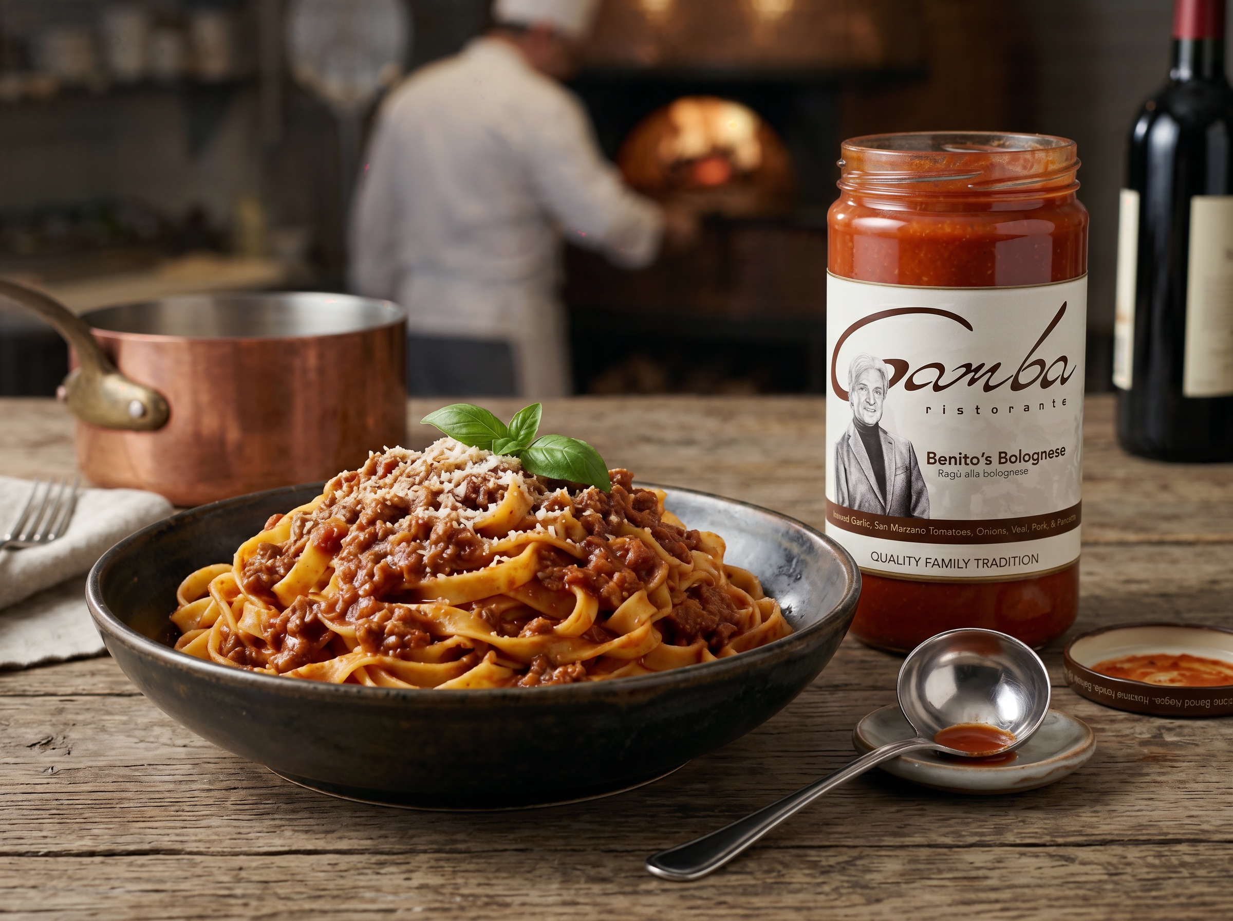
Benito’s Bolognese brings Gamba Ristorante’s identity onto a packaged sauce. The label combines the restaurant’s flowing wordmark with portrait artwork, a warm cream background, and deep brown typography.
The label
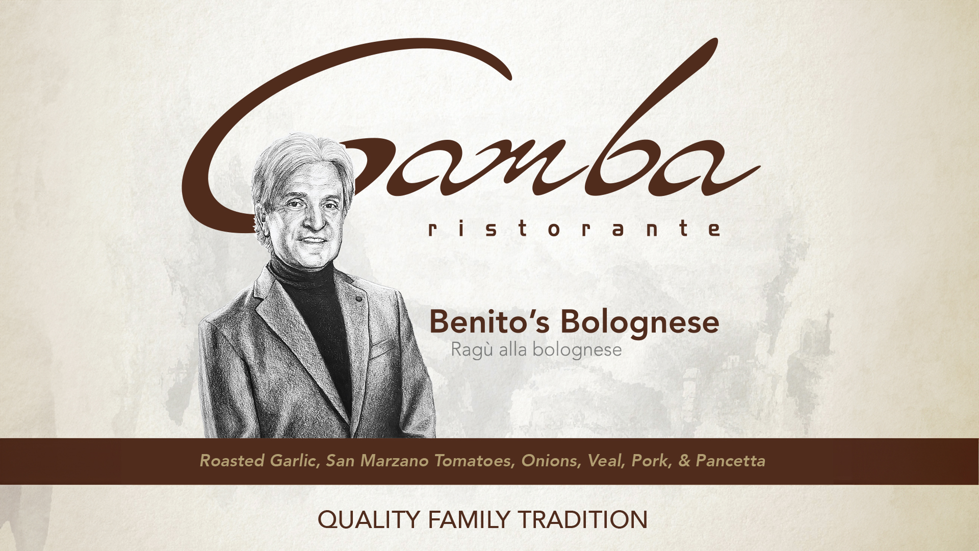
The composition gives the Gamba name room to lead. The portrait anchors the left side, while the product name and Italian descriptor sit alongside it. A horizontal ingredient band and the line “Quality Family Tradition” complete the label.
Identity details
The script wordmark and monochrome portrait connect the restaurant identity to the packaging. Viewed separately, they show the contrast between expressive lettering and the fine texture of the illustration.


The product in context
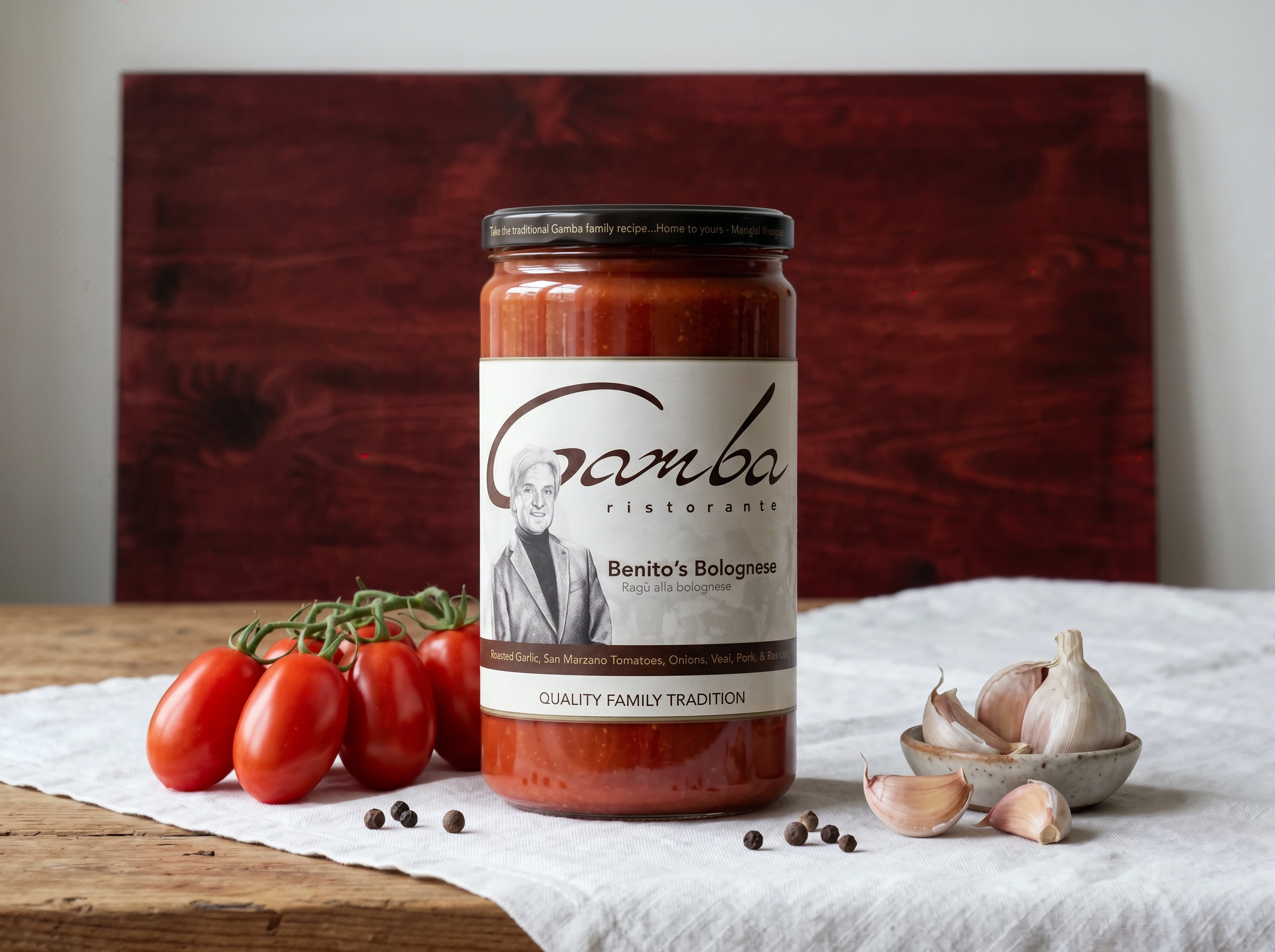
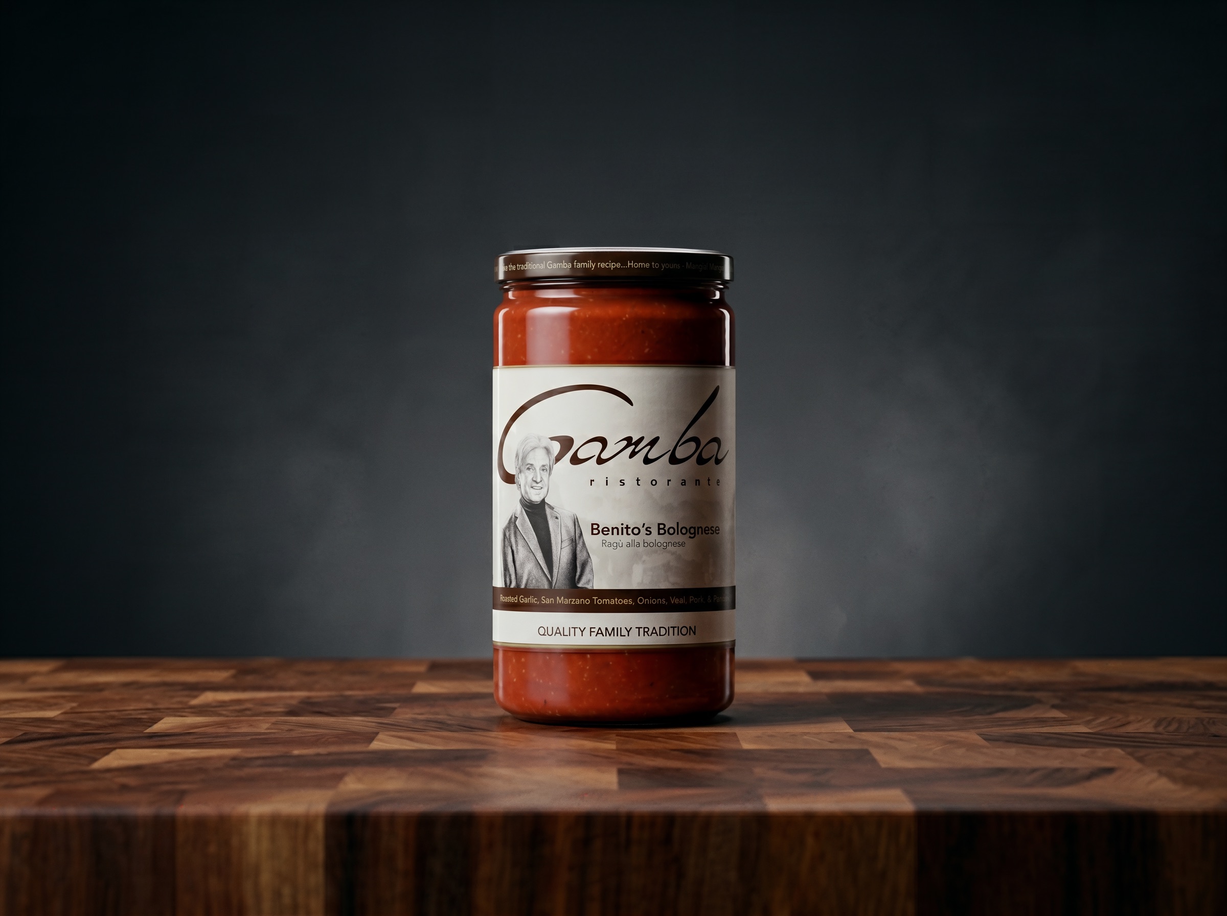
The product imagery presents the label in two settings: a simple studio composition and a kitchen scene with a prepared plate of pasta. The cream label and brown lettering remain the consistent visual elements.
The restaurant connection
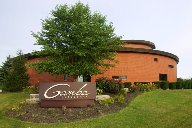
The exterior reference places the packaging alongside its restaurant context. The Gamba script provides a recognizable connection between the sign and the jar.